Single Page/Artist Website Critiques

Single Page Websites

The Good

The first single page website that I will critique  will be, Ian James Cox. His website utilizes a single page website that has a heavy use of illustration. It appears to be more complex at first, but is in fact based upon up and down scrolling on a single page.

Visit Ian’s Website Here!

Image

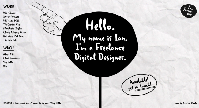
This site starts off with a short introduction to himself, where he states his profession as a Freelance Digital Designer. On the left side of the page, there is a fixed navigation bar. He also includes  credits, and a home section which are also fixed, and do not move.. The navigation bar is separated into two sections. The “Work” section, and a “Who” section. This nav bar appears at the same spot no matter where on the page you are.

Image

As you scroll down or up the page, the user is guided down a black line. The line curves at some sections and makes it appear as if you are moving sideways.

Image

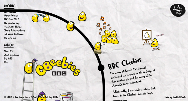
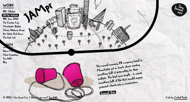
The line leads you to different sections of the page. The section that are featured, are each one of his works that are listed in the nav bar. It is not necessary to scroll all the way. You can click any of the works in the nav to jump to that section.

ImageImage

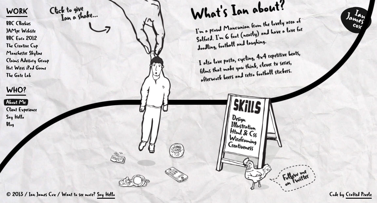
After the Last featured work section, you get to the “Who?” section. Here Ian gives you a little bit about himself and his skills. And also offers a little interactive piece that allows you to give Ian a shake by clicking on the illustration.

Image

His client experience is displayed, as well as the contact section. He offers an illustration that is interactive. You click right there and type your name, email and message. I think this is a good single page website for many reasons. First of all, It is straight to the point, without including unneeded information. It has a mostly black and white theme, with hints of color in certain objects or his featured work. The site is built very well and works how it should. The only thing I do not like about this site, is the fact that it takes a decent bit of scrolling between sections.

Image

The Bad

The next page I will critique will be Pusulaweb. This site is an interactive single page website.

Image

Visit Pusulaweb Here! http://www.pusulaweb.com/default.html

The web site consists of a picture of an island, where all the navigation is placed on. There is no scrolling, instead there are little speech bubbles over each section of the page. Once you click on the section you want, the page moves up and looks as if you are going under water.

Image

I don’t have motion sickness or anything but this almost gives me nausea. As the site moves down it motives up and down as if it were settling in the water. This is terrible! This site, as I said, does not scroll what so ever. Once in a section, you must click the back button to go back. This site is not a good example of single page design. Although it might be a single page, it does not appear to be so. None of the sections are accessible from each other. You must click into a page, then click back to get back to the homepage. So it’s kind of just like having a six page website.

The Artist

 Atmosphere

Image

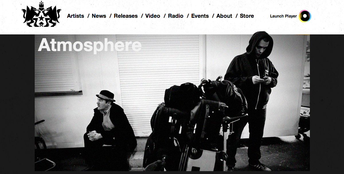
The artist I chose for my exercise 4 is Atmosphere. Atmosphere is a hip hop rap group from Minneapolis, Minnesota that consists of the main rapper Slug (Sean Daley) and DJ/Producer Ant (Anthony Davis). Atmosphere does not have their own personal website, but their Record Company Rhymesayers has a website that features all their artists. Each of the featuring artists have a single page dedicated to them.

Slug (Sean Daley)

Slug (Sean Daley)

Ant (Anthoney

Ant (Anthony Davis)

The artist pages consist of a header section with a picture of the group. Under this section there is a two column layout. This layout has potential to be useful, but for this is not so much. The reason for this is some of the sections within the two columns are much longer than others. This results in a bad way of managing space.
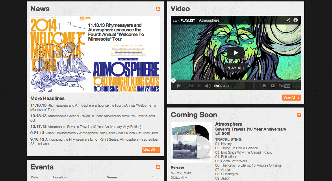
Two Column Layout

Two Column Layout

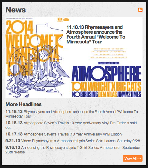
The sections consist of News, Video, Coming Soon, Events, and Artist Info. At the bottom, the section on the right extends far past any other section. This results in have a page of negative space to the left of the column for the whole length of the page at some sections.

Bad Space management

Bad Space management

Screen Shot 2013-11-19 at 8.50.08 PM Screen Shot 2013-11-19 at 8.50.15 PM Screen Shot 2013-11-19 at 8.50.23 PM Screen Shot 2013-11-19 at 8.50.33 PM Screen Shot 2013-11-19 at 8.50.42 PM

The color palate works well for this site. It consists of black background, with white sections. The “view all”, and links are all in orange and white. These colors work well for this artist, because of the main picture at the top. They use a black and white image of the two. So the colors used compliment the picture.

Let’s Get Digital

The Nuances of UX with Nick Finck

Image

AIGA of Jacksonville held the event Let’s Get Digital, The Nuances of UX with Nick Finck

Image

Nick Finck

Nick Finck is an influential information architect and user experience professional, and has been for over a decade. He does work with many high end companies such as Google, Amazon, Netflix, fandango and many more. Nick came to speak on User Experience at the Everbank Center in Downtown.

Learn more about Nick Finck at nickfinck.com.

Nick Finck created one of the first web applications for the iPhone and tablets. Nick does many talks and conferences for designers and students.

Nick stresses the importance of keeping the user interested. In everything from the way the app opens, to the way a secondary page slides into place on the screen. Fink states “It’s all about the experience the user gets with the product.” He focuses on the details of functionality. When opening an app, selected pages do not just appear there. They must have an interesting way of coming onto the page. Nick believes that good design and User Experience all boil down to a few main points: Design & Detail, Design & Simplification, Design & Process, Design & Research. These were the main points he lectured on.

Design & Detail

Nick started by showing a quote by designer Dieter Rams: ” Good design is thorough down to the last detail. Nothing must be arbitrary or left to chance. Care and accuracy in the design process show respect towards the consumer.” He continued on this topic by showing examples such as target, pinterest, and CNN. He discussed the design decisions by CNN of how the pages slide open. They do not simply appear, the slide in, and then ease to a stopping position. This, he claims, is a delightful experience. It offers a nice subtle movement that, If over looked, would most likely somehow just appear.

Screen Shot 2013-11-12 at 8.45.34 PM

CNN Money APP


Design & Simplification

Nick also began this section with a quote saying “Good design is as little design as possible.” He then stressed the importance of not trying to cram everything you can think of into your design. Simply only use what is necessary. Sometimes a little mystery is needed to captivate an audience.

Design & Process

Nick claims that most of his process is feature driven. He is forced to ask himself, “What does this do better for the user.” Every new product that comes out, must be better than the last.

Design & Research

Observation and Research are key to good designs or products. He tells of examples of how research in the most natural use are best to find hacks in products and fix them. He gave us an example of the Xbox Connect, how in different cultures people wave differently, which led to user issues. These would not have been discovered as easily if research in the field had not been done.

It’s Our Job

In this section Nick stressed the importance of designing for humanity, not just one person or company. He stressed that every design we should do should be for the better of everyone. Not just one aspect.

Learn about more AIGA and upcoming events:

http://jacksonville.aiga.org

http://www.aiga.org/


Author Website Analysis and Critique

Ken Kesey is the author of One Flew Over the Cuckoo’s nest, however he does not have a website, so I will choose three other authors of the fiction genre. 
 

The first author I chose was Walter Dean Myers. He is the author of many books some of which are We Are America, Carmen, Monster, Riot, Dope Sick, Game, and Street Love. Walters website consists of six pages. The Home page, Bio, Bibliography, Reviews, News and Contact.

Screen Shot 2013-11-04 at 11.41.11 AM

Walter Dean Myers Website

This page uses a fixed layout with two columns. To let you know which page you are on, there is a thumbnail image that pops up in the navigation bock in the background to highlight which page you’re on. Each link has a different image. I think that the welcome section is the most important on the homepage. It has a really nice paragraph about Walter. The paragraph is intriguing and leads you to want to know more about this author.

The Home Page

The home page consists of a two column layout with a navigation bar at the top followed by a slideshow featuring his books. This layout is present on all pages of this site. Below there are two columns of type. The left side consists of Walters welcome statement, and two paragraphs of a little bit about himself. He also provides links to his podcasts. The right columns contains a brief news article, as well as an informational video on one of his books.

Link to Podcasts

Image

Home Page

Image

Home Page Continued

Bio

This page has an extended biography on Walters life growing up and him getting into writing books. This page offers some photos of Walter as a kid and an adult. As well as a link to get a full size download of a photo.

Image

Bio Page

Bibliography

This page features a selection of some of Walters Published books with descriptions of them. He offers links to buy the books online as well as a link to see his complete bibliography.

Buy Walters Books Online

Image

Bibliography Page

Reviews

This page covers some of Walters Reviews and Awards. It also contains Reviews by Book, and a list of books with some links as well.

Image

Reviews Page

News

This section discusses recent news with the author. It has multiple listings with a link to read more about his current events.

Image

News Page

Contact

And finally the contact page features a website for Walters agent, another link to download a full size photo of him.

Download Full-Size Image

Image

Contact Page

Stephen King

Image

Stephen King

The second author’s website I chose to critique is Stephen King. This site also uses a fixed layout. It has a navigation bar at the top of the page. This navigation bar has links to the eight other main pages of the site, a search box, as well as smaller links to Stephen King Merchandise, a message board, and a miscellaneous page.

Visit Stephen King’s Website

Image

Navigation Bar

Home Page

Below the navigation bar on the home page, is an image to advertise one of King’s newest books, Doctor Sleep.

Image

Doctor Sleep Advertisement

Below this section there is a two column layout of New Releases on the left, and Latest News on the right. This is probably the most important sections of the home page. Viewers would most likely visit this site to look for his new releases.

Image

New Releases & Latest News

Library

This page features a two column layout with a  search function on the left, and categories to find books on the right.

Image

The Library

The Author

This page uses a three column layout. The far left column has an Unordered list of links such as; About the Author, Press Biography, Photo Gallery, and more. There is a picture of Stephen in the middle with text starting in the far right column wrapping around the image, then taking up all three columns.

Image

About the Author

This website also has includes a News page as well as Future works, FAQ, Mulitmedia, IPT and Dark Tower in the navigation bar.

Image

Secondary Navigation

Image

News

Image

Future Books

Wilbur Smith

Image

Wilbur Smith

The third and final author’s website I chose is Wilbur Smith. This site features a responsive design. The home page uses a three column layout. All of the pages contain a navigation bar at the top of the page with include links to pages such as; Books and Film, Early Years, Meet Wilbur, Gallery, Global Links, and Subscribe. This navigation bar uses a background graphic from a cover of one of his newest books, as well as a search bar function. It also has links to Facebook, Twitter and YouTube. This navigation bar can be found on every page.

Visit Wilbur Smith’s Website

Image

Home Page

This page uses a three column layout with a background image. It uses a big graphic taking up the width of the page advertising his newest book. Under this section there is more information on this book, as well as a section for latest news, and Appearances. There is a footer which contains thumbnail images of his other book covers.

Image

Home Page

Image

Footer

All of the other pages follow a two column grid with a smaller column on the left and a larger column on the right.

Books & Films

This page features more information on Wilburs other books and films, as well as links to some of his series.

Image

Books & Films

Early Years & Meet Wilbur

These pages are very similar in layout and information. The Early Years page has information on his Early Years series. The Meet Wilbur page contains a short biography section as well as some images of wilbur.

Image

Early Years

Image

Biography

Penguin Publishing

This site is very similar to all the authors websites. It contains a navigation bar at the top. The major difference is the amount of columns and information. This site tries to feed you much more information on each page.

Image

Penguin Publishing

Website Critique: FedEx vs. UPS

Design Analysis

Introduction

FedEx and UPS are package delivery companies that deal with shipping all over the world. Each companies website offer many services for shipping, or tracking objects that have been shipped online. However, both of these companies present these online services in different ways, and layouts. FedEx’s website offers a more simplistic layout, with better navigation abilities, where as UPS relies on trying to deliver you more information from the get go, by packing in much more content into the columns and sections.

Homepage

Image

UPS home page

Image

FedEx home page

Both FedEx and UPS offer many of the same services. FedEx presents the information in a more user friendly way by making common actions easier to complete with less clicking and searching. UPS presents their site with a more news oriented layout. They position a big call to action image right in the middle of the page, with a News and Information section directly below it (see images above). They both offer the same services, however on the UPS site, you must click the navigation section you want, to open up its other subsections of the section. Some of the similarities they have in common are the easy access section to tracking. Both sites offer a text box to insert the tracking number, with out any additional clicking from the homepage (see images below).

Image

UPS Drop Down List

FedEx’s website also provides more information on the drop down navigation sections with more organized menus, and small thumbnail pictures.

Image

FedEx Drop Down List

Navigation

FedEx‘s layout and information is organized in a way that makes it easy to navigate. The left side bar provides log-in options, as well as Quick Access to links that are mostly secondary sections of navigation.

Screen Shot 2013-10-28 at 1.33.48 AM

FedEx’s Left Sidebar

FedEx also provides you with three main modules right in the middle of the page that allow you to, Track a Shipment, Find a Location, and a section on News. These three sections are the most common reasons the user would visit their site. By placing these sections right in the middle of the page, it offers a good hierarchy by giving the user a quick and convenient way to find what they need as quick as possible. FedEx utilizes a Fluid layout, where it adjusts depending on screen size.

Screen Shot 2013-10-28 at 1.37.31 AM

Three main sections

UPS relies on placing more importance on News and the Call to action section, where they feature savings quotes. They feature a section on the left side depicting the perks of using UPS “My Choice”. Even though the two companies provide the same services, UPS’s website requires additional clicking to other links to do the same thing that is directly on FedEx’s homepage.

Screen Shot 2013-10-28 at 1.39.47 AM

Call to Action

Screen Shot 2013-10-28 at 1.40.22 AM

News Section

UPS uses a Fixed layout rather than a Fluid layout. UPS has a huge section of white space when the screen is dragged to the edge of my viewport. The fixed layout is small even for my 15″ laptop screen.

Evidence of Fixed Layout

Evidence of Fixed Layout


Grid

The FedEx home page utilizes an eight column grid.

FedEx Grid Structure

FedEx Grid Structure

I believe the UPS home page utilizes an eight column grid as well. Although I am not as sure, because it was not as clear.

UPS grid structure

UPS Grid Structure

Secondary Pages

On the secondary pages of FedEx, they mostly use a single or two column layout with more information on that section. Such as shipping or managing. On the UPS site, the same sections use a variety of columns, one of the pages uses one column, one uses two, and the third uses three columns. It is less consistent than FedEx.

FedEx Shipping Page

FedEx Shipping Page

UPS Shipping Page

UPS Shipping Page


UPS’ color palate consists of a variety of colors. They use about 4 or 5 different colors per page. They use the brown and gold of the logo, they also use a light blue, as well as a blue gradient, and an additional tone of yellow. FedEx’s site simplifies the color palate to mostly two tones of white, and two tones of gray, and the purple of the logo.

Example of UPS Color Palate

Example of UPS Color Palate

Example of FedEx Color Palate

Example of FedEx Color Palate

Conclusion

Overall, I think that FedEx’s website was built much better than UPS. It seems to follow a specified grid structure, it is responsive in the fact that it uses a Fluid or Hybrid layout. Even though both of these companies are providing the same services, FedEx presents that with a more organized page structure utilizing good hierarchy and flow.

Visit these sites here:

FedEx: www.fedex.com

UPS: www.ups.com

Blog Post #2 Typography and Web Design

The first article I chose was:

“A Web Designer’s Typographic Boilerplate” by Ian yates.

http://webdesign.tutsplus.com/articles/typography-articles/a-web-designers-typographic-boilerplate/

This article emphasizes the importance and convenience of using a typography.css when creating websites. Ian uses separate css files for type styling that will come in use with any type of body copy. Doing this makes it easy to save certain styles to be used for later. He offers numerous css codes to help a site have better readability.

Image

As well as codes to help smooth the rendering of typefaces, and a good set of font sizes for all six of the headings available.

Image

Image

Ian also gives useful information on codes for customizing word breaks, block quotes, and print styles. He points out the necessity to make sure when you click the “print” button, it gives a better printed style. He stresses the importance of getting rid of any backgrounds so that they do not waste toner or ink, and to make sure everything prints out in black. He gives a code to help smooth that out as well.

Image

I found this article very useful and will return to it in the future for references.

The second article I chose was:

“Web Typography: 7 Typographic Rules You Can’t Pass By”, by Rebecca Desfosse.

http://www.webdesign.org/web-typography-7-typography-rules-you-can-t-pass-by.22300.html

In this article, Rebecca points out the main rules not to break in Typographic perfection, or rules to break to obtain a stylish way to compliment the type. The first rule: Don’t use too many different fonts. For web browsing, users want simplicity and readability or they will leave your site. By using fewer fonts, it helps smooth the readability. She emphasizes the importance of kerning type. Rebecca states “Proper kerning (balancing the white – space between your letters) makes a dramatic impact on your typography and can improve your overall site design by leaps and bounds.” Rebecca also states the importance of using typographic hierarchy in design. This helps to smooth and guide the reader around a page. She also expresses the importance of never using comic sans for anything… ever.

Image

Finally, Rebecca recommends to break the rules sometimes, when necessary. “Every web designer worth their salt knows that the rules should be broken when necessary – especially when it would lead to a stunning design.” This article is a good reference for a beginning typographer. It covers the basics to setting typography for the web.

What are the differences between setting type for web and print?

  • Setting type for print and web are very different.  First, with web you are working with RGB colors instead of CMYK. With web, you must consider file type. For example: .jpeg files are not the best choice for type. .gif or .png file types are better suited for type and web. When setting type for print, you can get away with a longer line lengths, and smaller font sizes. It is also easier to get away with using serifed typefaces.

How should type be set for the web?

  • Typography set for the web should use a very readable font, often most of which are sans-serif typefaces. There should be sufficient leading to allow enough space between lines. Line lengths should not be too long, this can make reading lots of information difficult.

Are there any restrictions to setting type for the web?

  • Restrictions for setting type for web would include not using ornate faces for body copy. Supply enough leading to allow for good readability. Never use comic sans, ever. Use a very legible typeface. Lastly, establish a good typographic hierarchy within your site.

What benefits do you see to using @font-face, and web fonts?

  • Using @font-face, and web fonts, are already suited for web. They have been made to be viewed on the web. They offer less chance of problems when it comes to viewing type on web.

The two sites I chose, that I think have good use of typography are:

The Black Sparrow, is a quality lounge and drinkery utilizing a vintage 1930’s drunk Bukowski theme. This website offers an interactive and responsive site with numerous examples of good typography. It has a vintage feel and plenty of typography examples that reflect that. Black Sparrow’s website is well designed with interactive tabs that roll over to images when hovered over. This site breaks the rules in some instances (using a small serif face for body copy, on the “our story” section)  but mostly to achieve the vintage feel of the theme. It has many different typefaces and sizes which contribute to the eclectic style desired. The font size is a bit small in some sections – and compromises readability a bit – which could use some work.

ImageImageImageImageImageImageImage

Served MCR is a site for a ping pong charity competition in manchester. This site uses a lot of background illustrations as well as a rough and hand-drawn approach to the typography. The body copy is set in a nice sans-serif typeface with plenty of leading for good readability. The hand drawn look normally may not be the best idea to have all the headings and announcements set in, but it works for this site, since it does not have a ton of text. The type compliments the doodles in the background as well.

ImageImageImageImage

Blog Post 1: MagicSeaWeed

The website I chose to blog about is http://www.magicseaweed.com. It is a surf report and forecast site for surf spots all around the world. I use this website to look up weekly forecasts for local surf spots, such as jacksonville beach, and for when I travel. On the homepage of this website, starting at the top, there is a bar with different options. Located on this bar, is a quick finder for a surf location. It offers a drop down arrow that shows countries, with major states or territories that are popular for surfing. Once you select the state or country, you go to the drop down box next to it where you select specific cities or states. Once a city is selected it offers a wind and swell direction, compared to the shape of the coast. It also shows the current size of waves, and more details on wind speeds, primary swell size, and tidal information. As seen below. Also on this top bar there are options for an overview of a surf spot, webcams, charts, live feeds, and hurricane information. 

Image 

Below this section is a weekly forecast for the predictions on wave size. And below this section, is another weekly forecast, with further details about each day. It shows the daily forecast separated by 3 hour increments. This table also shows primary swell size and time of occurrence, wind speed and direction, and the air temperature for the different times of day.   

Heading back to the homepage, there are many options and things to do. The page is set up with three columns. At the top left, there is section titled “Latest Photos.” This shows numerous pictures of different surf spots that people post all over the world. Under this section is a “Features” section, featuring articles and information on famous, or new surf spots. At the top right, there is a picture slideshow, that features new popular locations, or interesting articles. This section spans out of the two columns on the right side of the page. Directly under this sections is another table that spans two columns, titled “Latest Surf Forecast Charts.” This sections has links to Latest Swell Height, Latest Swell Period, Latest Wind Speed, and Latest Pressure Chart. Under these sections you will find a “Video of the Day” table, “Find your Spot”, and “Contest News”. All being self explanatory. At the very bottom there is a section for “Latest Videos”, and below that there are links to other websites, and there other web pages. This website is very effective at providing the kind of information a surfer would want to know about a certain location.

 Image

I believe that this website is a success. It uses some of the main design principles such as using repetition in the way the treat the sub heads, and headings of the site. They use alignment between the three columns. Some of the tables span two columns, and are aligned so that the other tables, (spanning only one column each) are positioned with even spacing under and between the tables that span two columns. Finally at the bottom of the homepage, there is a table that spans all three columns. There is use of contrast in the table headings, being black, and the background of the webpage, being white. The website is definitely designed for people who surf, body board, paddle board, or any other sport involving the ocean, or who rely on certain ocean conditions. The content is catered to them by providing anything one would need when checking wave, weather, wind, and tidal conditions making this website very successful. One improvement I would like to see would be to see a live cam for each spot. Granted this would be very difficult to instal live cams to every surf spot in the world. Other than that I have no complaints about the website.